08 April 2009

Between Silence + Light

CRAFT:

Craft is very important in everything that you do and design. Craft can make or break a design. We are always told to make everything with great craft, even if it is only a sample or rough draft. This is also good practice for the real and final product. Montecello and Falling Water both had excellent craft in the way they were constructed. It was obvious that there was a lot of thought put into the two buildings. The details of how light would affect the interior and exterior was also thought about particularly at Falling Water.


PUBLIC/PRIVATE:

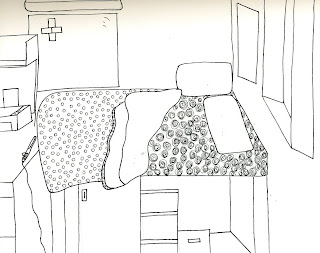
Most places have seperate areas of public and private spaces whether it is in a home or commercial building. Usually in homes private spaces include the bedrooms and offices. Public spaces include the living area, kitchen, entertainment areas, etc. In commercial buildings the offices would be considered as the private area. Conference rooms would be an example of a more public space.


TECHNIQUE:

How something is performed or done is usually different from person to person. A technique would be the way a certain person chooses to do something. By having different techniques with people, we get a variety of different outcomes which produces a more creative and abstract world. Although this is true, this also brings unity. Different techniques help out individuals who may not know their own specific way of constructing something yet.


LANGUAGE:

Language is important throughout the world. The way you speak can show knowledge. Being able to use words and phrases in the correct manner lets others know you have knowledge about that specific topic. Designers also want language to be seen within their projects. Design words are used in projects and it is successful when you are able to see them within.


VIRTUAL:

This past week in my religion class we have been talking about virtuality in Christianity and in Judaism. I have learned that it means the essence of being, but not in fact. Christianity and Judaism are not the only religions that virtuality would apply to but majority of them. They all have a belief but it is not "in fact". It was interesting to see one of our words in another view besides design.


http://rationalrevolution.net/images/jesus-bible-14g.jpg

25 March 2009

Grammar : Syntax

[RE] VISION

Drawings and designs both have to revised at some point in each of our iarc classes. In studio, we are designing a 3rd skin. As we go through the process of design, we alter different parts of our design in order to have a successful design. We also do this in drawing and drafting. Our first drafts may need to be done over in order to achieve the best outcome.


AUDIENCE

An audience listens and participates in what is being presented to them. Last Friday, Khoi Vo came to speak infront of audience that I was a part of. As he was presenting his slide show the audience listened to what he had to say. At the end, the audience approached questions and comments in order to understand and engage in his presentation.


http://www.artmill.eu/app-content/files/staff/khoi-vo.jpg


CHARACTER

Character helps to define a person, place, or thing. The person we try to be describes our character. A designer in itself is an example of a character trait. In the work that is accomplished by a designer shows character of the piece as well as the designer. Certain attributes to buildings such as columns or domes add character.


http://media-2.web.britannica.com/eb-media/33/91733-004-0DC72BE5.jpg

TRANSITION

In studio, we transition into different steps in the process of design. We start at the basic step with brainstorming and gathering materials. We then go further to transition that into a drawing and model. Each transition goes further into the design to produce the final product. The transition is also important to have a purpose for your design.


DATUM

In drawing and drafting, we use datums in order to construct lines which form a design. A datum can be a line or point. It is a reference to help decide where the correct location of a line should be. Datum's do not have to be visible, they are usually just a guide to help create the image.


As designer's, we use these words in our work everyday to have a more successful design. We revise and alter to have a better design. We have a certain process we go through in order to get the final product as well. Character is put into our designs to represent the character of ourselves. We also show character to our audience by the way we present our work.


18 March 2009

P Week


PERIPHERY:

Periphery is the external boundary of something. This could be the outer edges of a building or even a boundary surrounding a building. In studio we worked with the periphery of a portal: panel. My group created a design that related back to the history of the Lion’s Gate as well as with our past projects from studio. By using what we had, we focused on key points to get the purpose of the boundary across to our audience.


PORTFOLIO:

In Stoel’s class we turned in a portfolio for our midterm. This contained a collection of work that we had done so far within the semester. The work consisted of floor plans, sectional views, elevations, and other drawings relating to furniture and buildings. Stoel was able to see the strengths and weaknesses of each individual by this process.


PROCESS:

Process is the way designs are created. Any job in the real world has a particular process they go through in order to achieve a successful final product. In studio this week, we wrote a paper on the relation between story and design process. The way they are put and brought together are very similar in the term of process. It starts by brainstorming, having successes and failures, getting others involved, and finishing with the final outcome. With Suzanne, we went through a process to get to the presentation of our building from campus. We started out by doing multiple drawings and getting critiqued. We would then redo them and create new ones. Once they were completed, we decided a layout for a presentation board so that we can now present our final product.


PERSPECTIVE:

Now that we are back from spring break, we are working on perspectives with Stoel. We learned to draw objects in one and two-point perspectives. These drawings let the viewer see different angles and images of the object desired. In these perspectives we were taught with proper technique by using proof. The proof shows that the measurements are exact and are located where they need to be.

PROFESSIONAL:

A professional knows what their work is about as well as being good at what they do. At High Point University we had the chance to listen to a real professional, Julian Alexander. He is a first American male designer to ever create his own fabrics for his clothing and designs. We learned how he began and how he got his inspiration. He was very knowledgeable in the design aspect. He is a success because he is not only good at what he does, but knows how to please his clients.


http://www.artnet.com/Magazine/people/barone/Images/barone7-6-12.jpg

http://iidexneocon.com/2006/images/uploads/PRODUCT_PREVIEWS_-_Mayer_Alexander-Julian-fabr.jpg

05 March 2009

25 February 2009

24 February 2009

Voices


http://www.metricconversion.us/metric-english-400.jpg

METRIC

The metric system is universal. Interior architects/designers measure everyday in order to make things accurate and correct. In our classes we have been measuring rooms, models, plans, etc. We do this in order to have correct measurements for various reasons such as positioning of objects. By having the right measurements we are able to make scale models and figures in order to test ideas and work out any problems.

PRECEDENT

Precedents are used in order to feed off of and to build your own ideas. Precedents can be people, objects, buildings, etc. They serve as examples of work that are in effect. I have used several different precedents for projects throughout the past couple of years. Last year I did a precedent study in Patrick's class on the Baths of Diocletian as well as on our twig project in studio. I used a bridge to represent as a precedent for my creation of 12 twigs. Another example in everyday life of this is the United States Capital building. The Capital building was built off the idea and creation of the Roman Pantheon. It includes the large dome as well as using the columns in the front.


http://www.destination360.com/europe/france/pantheon.php


PRESENCE

The presence of something is the state of being present. Suzanne has taught us that in order to get more details and a better drawing of something is to be there drawing it physically. This is better than taking a picture where you cannot see it as 3-deminsional as it really is. We have done that this past week by drawing certain buildings on campus. I have been drawing the Curry building and have been present at my location to get a better drawing. We also did this with the drinking and drawing project with Suzanne. We were told to go out to places such as a coffee shop and draw what we saw.


MOMENTS

Capturing moments of something is important to feel the meaning of what is created. By using thumbnail sketches, we have captured moments with our 3-deminsional black and white objects. We also used this same approach last year with our cell phone and stick project. Even in our personal lives, we like to celebrate important moments to us. Usually we do not remember a whole story or time, instead, we remember moments.


DUALITY

We looked at duality with our models that we have made as well as with our fairytales. Most ideas and creations have multiple dualities in order to serve their purpose. The more there are the more functional and successful the design is. We see this in good design within a home. The more ways a room is functional, the better. By doing this, more people’s needs are met and the room is successful.


Designs use a variety of techniques and ideas. We begin my being present at a certain place. This brings ideas to the designer and serves as a precedent. We then measure out what we are wanting to create and find a certain scale for the design. The more we get into it we create moments and duality to help enhance what we are creating.